
Vector color separation turns your artwork into printer-friendly layers so each ink prints cleanly and in perfect registration. This guide breaks down the fundamentals, explains common techniques, and walks you through the practical steps to create print-ready files for T-shirts, hoodies, jackets, and other apparel. If you want expert help, Mahi Digitizing offers professional separation and file-prep services.
What Is Vector Color Separation?
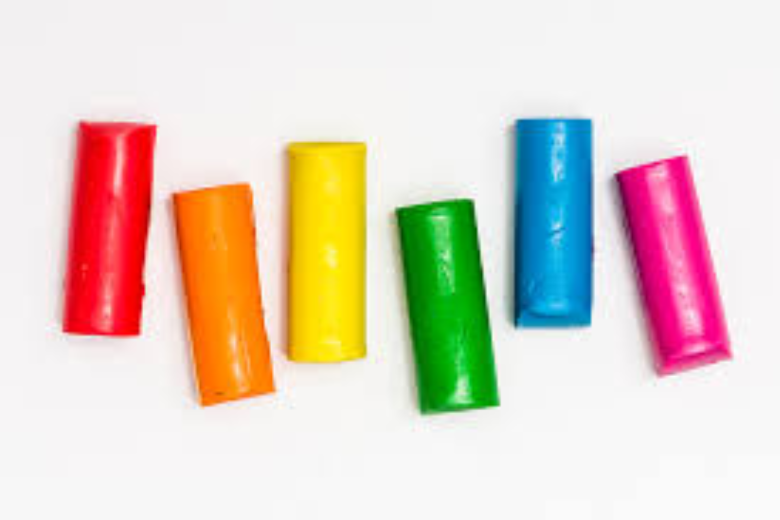
Vector color separation is the process of dividing artwork into individual color layers so each color can be printed separately. In screen printing, each separated color becomes a different screen. This isolation lets printers control ink application and registration precisely.
Because vector files use paths instead of pixels, they scale without losing edge clarity. That makes vectors (AI, EPS, SVG, PDF) the preferred format for logos and textile graphics destined for large or small prints.
During separation, designers convert colors into spot colors or channels that match inks. This gives print shops exact guidance on which inks to mix and which screens to produce.
Vector separation also allows for intelligent trapping and overlap planning so neighboring colors don’t leave gaps when printed on fabric with movement or stretch.
Separating artwork manually in vector software ensures clean edges and preserves small details that automated raster separations might ruin. It’s a good practice for brand-critical elements like logos and type.
If you’re unsure whether your file is vector-based, check for editable paths in Adobe Illustrator or ask a digitizing service. We can convert raster logos to clean vectors when needed.
For professional results, hand-tailored vector separation beats automatic tools — and it reduces surprises at production time. If you’d like help, request a quote.
Why Color Separation Matters for Apparel Printing
Proper color separation ensures printed colors match your brand and look sharp on fabric—especially important on textured or dark garments that need underbase layers.
Without separation, inks can overlap unpredictably and cause registration issues, fuzziness, or color shifts after the first wash. Separation prevents those problems by planning ink overlap and trapping.
Good separations reduce ink usage and production time because printers know exactly which ink goes where and how many screens to prepare.
For dark garments, a white underbase is often separated as its own layer. The underbase lets colors appear vibrant instead of muted when printed over dark fabric.
Separation also lets you choose between spot inks and CMYK/ simulated process depending on color complexity and cost constraints—this choice impacts both look and budget.
Businesses that run accurate separations get fewer reprints and more consistent brand color reproduction across batches and suppliers.
Need a walk-through or proofing? See practical separation techniques in this external resource from Printavo: Understanding Color Separation for Screen Printing.
Types of Color Separation Techniques
Spot color separation assigns each solid color to its own screen and is ideal for logos or designs with a limited number of flat colors. It gives the cleanest, most vibrant results for brand work.
CMYK process separation breaks artwork into Cyan, Magenta, Yellow, and Black channels. It’s suited for photo-realistic images but may need careful adjustment for fabric printing.
Simulated process separation uses halftones and selected spot colors to reproduce gradients and photos on apparel—great for complex images on light or dark garments.
Index color separation uses fixed solid-color tiles (small squares) to simulate color blends and can be efficient for limited-color prints or small art areas.
For dark garments, include an underbase (typically white) as a separate layer in your separation to help colors pop and maintain vibrancy.
Choosing the right technique depends on design complexity, production budget, and the end-use—talk to your print vendor or contact Mahi Digitizing to pick the best option.
For Pantone spot matching and industry color standards, refer to the Pantone guides or work with your printer to ensure accurate ink mixes: Pantone.
Preparing Artwork for Separation
Start with clean vector artwork. Convert text to outlines and remove hidden layers or effects that might interfere with clean separations.
Organize your file with named layers for each color and include a color key that lists Pantone or CMYK values for each separated area.
Avoid unnecessary gradients and raster effects unless you plan to convert them into halftone separations. Gradients require special handling to translate for screen printing.
Check stroke widths and tiny details—anything thinner than the minimum line the printer can handle should be thickened or simplified.
Create an underbase layer for dark garments and mark any elements that require metallic or specialty inks, varnish, or foiling as separate layers.
Save final versions in production-ready formats (AI, EPS, PDF) and include a flattened proof or PNG to show the intended look to the printer.
If you use Adobe Illustrator, this official guide helps with vector workflows: Adobe: Vector Graphics basics.
Practical Tips for Beginners
Keep your color palette limited—fewer colors reduces screen count and production costs while simplifying registration control.
Label layers clearly (e.g., “Red_Spot_1” or “Underbase_White”) and provide a color key so the print shop immediately knows what you expect.
Use bold shapes and avoid tiny text or fine hairlines unless you plan to embroider or use digital print methods that support fine detail.
Always request a digital mockup and, where possible, a physical test print or strike-off to verify separations and underbase performance on the actual fabric.
Communicate with your printer about their minimum line and gap tolerances—this prevents separations that can’t be reproduced reliably on press.
Keep an archive of your final separation files and production notes (screen counts, mesh, inks used) to ensure consistent reorders later.
If you want expert help rather than DIY, Mahi Digitizing provides separation, proofing, and print-ready file delivery.
Common Mistakes and How to Avoid Them
Submitting raster images or low-resolution files is a frequent error—start with vector art to keep edges crisp at any size.
Not including an underbase on dark garments leads to dull prints; always separate and number the underbase as its own layer.
Overcomplicating separations with too many tiny halftones makes registration difficult—simplify where possible or increase halftone sizes.
Failing to proof or request a strike-off can lead to costly reprints. Always test a sample before full production.
Using inconsistent color naming or omitting Pantone/CMYK values confuses print shops—provide a clear color key for every file.
Not discussing garment type and ink choice with your printer can result in poor adhesion or fading—talk materials and wash tests beforehand.
Mahi Digitizing double-checks files for these issues and delivers production-ready separations to avoid these common pitfalls.
Conclusion & Next Steps
Vector color separation is a practical skill that improves print quality, reduces surprises in production, and keeps brand colors consistent across apparel runs.
Start with clean vector art, choose the right separation technique, and always proof a physical sample when possible to validate your choices.
Maintain a color key, label layers, and keep production notes like mesh counts and ink recipes for future runs and consistent output.
For beginners, partnering with an experienced digitizing and separation service speeds up the process and reduces costly mistakes.
If you need professional separations, proofs, or help converting artwork, contact Mahi Digitizing and we’ll walk you through the workflow.
Ready to get started? Upload your artwork and request a quote—we’ll prepare production-ready files and a test proof for your approval.
Great prints start with smart separations—make them part of your design process and watch your apparel come to life with professional, repeatable results.