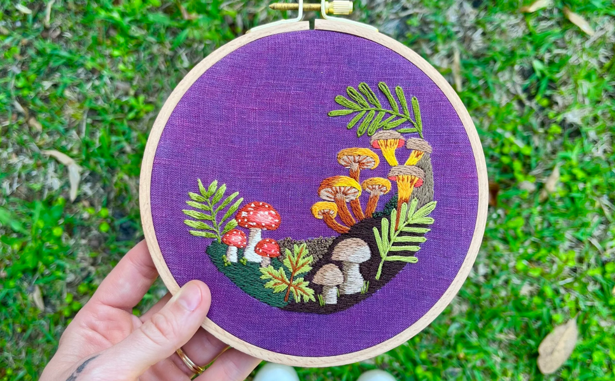
Color plays a critical role in the visual appeal of chenille embroidery. Whether you’re designing for varsity jackets, fashion pieces, or branding patches, the right color combinations can make your design pop. At Mahi Digitizing, we help you choose bold, coordinated color schemes that enhance your chenille designs and bring them to life.
Understanding Color Impact in Chenille Design
Chenille embroidery is known for its bold, textured look—making color selection even more important. The yarn’s soft, fuzzy surface reflects light differently, giving colors extra dimension.
Choosing the right combination helps highlight elements like initials, mascots, and decorative borders. Contrasting hues create visual separation, while complementary tones offer harmony and flow.
We recommend beginning with a base color that matches your garment, then building accents that either contrast or match brand palettes.
Colors should also reflect the purpose of the design. For example, school patches often use bold primaries, while fashion pieces lean toward muted tones.
At Mahi Digitizing, we guide every client through practical color selection for embroidery that stands out and stays timeless.
Classic Combinations That Always Work
Some color pairings never go out of style. These timeless combos are often used in sports, schools, and legacy fashion brands.
Red and white, navy and gold, or black and silver are just a few examples of high-contrast palettes that create impact without overwhelming the design.
Because chenille has a thick texture, these combinations help shapes and letters remain crisp and defined even from a distance.
For brand-centric patches, matching logo colors to these classic duos often enhances recognition and consistency.
We help replicate traditional palettes while ensuring they still feel fresh and professional for today’s trends.
Modern and Trend-Driven Color Schemes
While classic colors are safe, modern trends open new possibilities. Earth tones like sage and tan, or pastel sets like lavender and cream, are gaining popularity in lifestyle brands.
These softer palettes work especially well for fashion-focused chenille patches, offering a more sophisticated, subtle appeal.
Neon accents, ombré layering, and multicolor outlines are also becoming common in custom apparel lines.
To stay current, we follow fashion industry color forecasts and integrate them into chenille embroidery designs where appropriate.
At Mahi Digitizing, we balance trend and longevity to make sure your designs feel relevant now and remain stylish later.
How to Use Borders and Outlines Effectively
Outlines are essential in chenille embroidery. They help separate layers, define edges, and add contrast to soft yarn surfaces.
Choosing the right border color enhances visibility—especially when the patch is used on busy or dark backgrounds.
We often recommend black, white, or metallic gold/silver as neutral outlines that boost structure without clashing with your main palette.
In multicolor patches, outlines create hierarchy by making central letters or icons stand out first.
We digitize all chenille borders with optimized stitching paths to ensure the thread doesn’t flatten the chenille surface.
Recommended Color Combinations by Theme
Here are some winning combos to consider for specific styles:
- School & Varsity: Navy + White, Red + Black, Gold + Royal Blue
- Streetwear & Fashion: Tan + Cream, Olive + Charcoal, Dusty Pink + Gray
- Corporate & Brand Patches: Black + Silver, Blue + Yellow, Gray + Red
- Kids & Youth Apparel: Bright Blue + Yellow, Pastel Green + White, Orange + Navy
- Luxury & High-End: Black + Gold, White + Metallic Silver, Burgundy + Cream
We tailor each design based on these themes and your brand identity to ensure your patch turns heads.
Balancing Contrast and Cohesion
Great color design strikes a balance between contrast and cohesion. Too little contrast, and the patch looks faded. Too much, and it appears chaotic.
We recommend pairing a dominant color with one or two accent tones. This keeps your design bold but balanced.
We also use border spacing, letter size, and negative space to give colors room to breathe.
By applying these principles, we keep your chenille patches clear, legible, and visually harmonious from every angle.
Our design team carefully tests color pairings before digitizing to ensure accuracy on fabric.
Common Mistakes to Avoid in Chenille Color Selection
Even great designs can fall flat without smart color planning. Using too many hues or not enough contrast are common mistakes we help clients avoid.
Another issue is choosing trendy colors that don’t match the brand or garment—leading to quick fade-out.
Chenille yarn also absorbs light differently than flat threads, so poor planning can dull your logo under certain lighting.
We provide mockups and adjust saturation levels to maintain vibrancy in every environment.
When you partner with Mahi Digitizing, we ensure your chenille patch colors are strong, smart, and suitable for long-term use.
Let Mahi Digitizing Perfect Your Color Story
At Mahi Digitizing, we bring more than embroidery—we bring design insight. We work closely with you to select the most stylish and functional color combinations for your chenille patches.
Whether you’re crafting sportswear, school gear, or fashion collections, we tailor each palette to your goals.
Our process includes digital previews, expert advice, and production-ready files that help you stand out.
From vintage varsity colors to custom gradients and outline blends—we do it all with precision.
Request a free quote or contact us today to start creating standout chenille embroidery with perfect color harmony.

